
How To Do Hierarchical Clustering
Contents
- Introduction
- How to cluster data
- Getting similarity data
- Clustering data by hand
- Sorting the matrix
- Other visualizations
- Next steps
Introduction
My interest in hierarchical clustering started with a Microsoft Excel plugin. In my design analysis class, our instructor showed us how to algorithmically cluster data using a plugin written for an old version of Excel. Clustering data lets you take a set of concepts, like topics that came up during user interviews, and reduce them down to a smaller set of high level categories. One example of where this is helpful is with qualitative data codes. A set of interviews might produce hundreds of very granular codes, but clustering them into groups helps make them easier to talk about than the raw codes would be. You can think of clustering as a more rigorous alternative to affinity mapping—instead of writing interview codes down on Post-It notes and rearranging them into groupings on a wall, hierarchical clustering does something similar. It also does it in a way that produces several visual artifacts that can be very impactful when summarizing research.
I immediately took to clustering as a method, and, knowing how to program, I took it as a challenge to learn how this kind of clustering works and to write a new implementation that didn’t depend on Excel.
I ended up implemented an algorithm for clustering in Python, and I gave several talks and workshops on how to incorporate clustering into UX research—both to share what I learned but also to see how other people used these techniques.
Here is some excerpted information I use when introducing how hierarchical clustering works. I hope you’ll find it as useful as I do.
How to cluster data
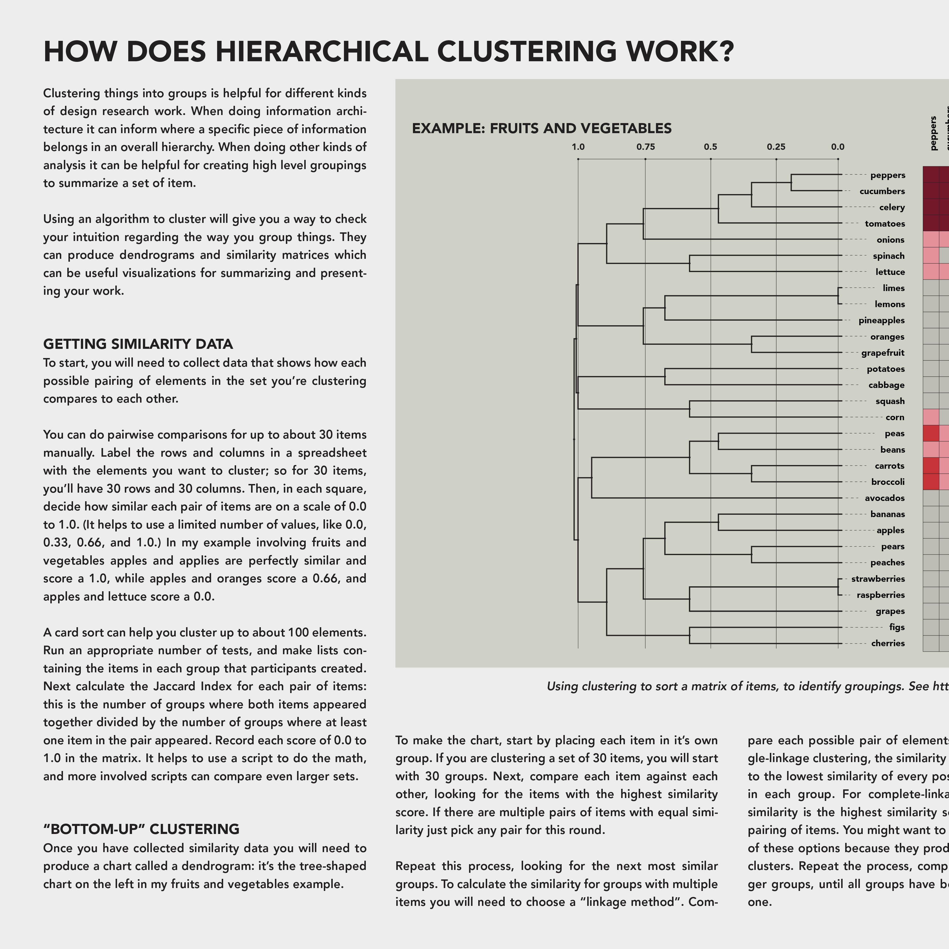
Clustering things into groups is helpful for different kinds of design research work. When doing information architecture it can inform where a specific piece of information belongs in an overall hierarchy. When doing other kinds of analysis it can be helpful for creating high level groupings to summarize a set of item.
Using an algorithm to cluster will give you a way to check your intuition regarding the way you group things. They can produce dendrograms and similarity matrices which can be useful visualizations for summarizing and presenting your work.
Getting similarity data
To start, you will need to collect data that shows how each possible pairing of elements in the set you’re clustering compares to each other.
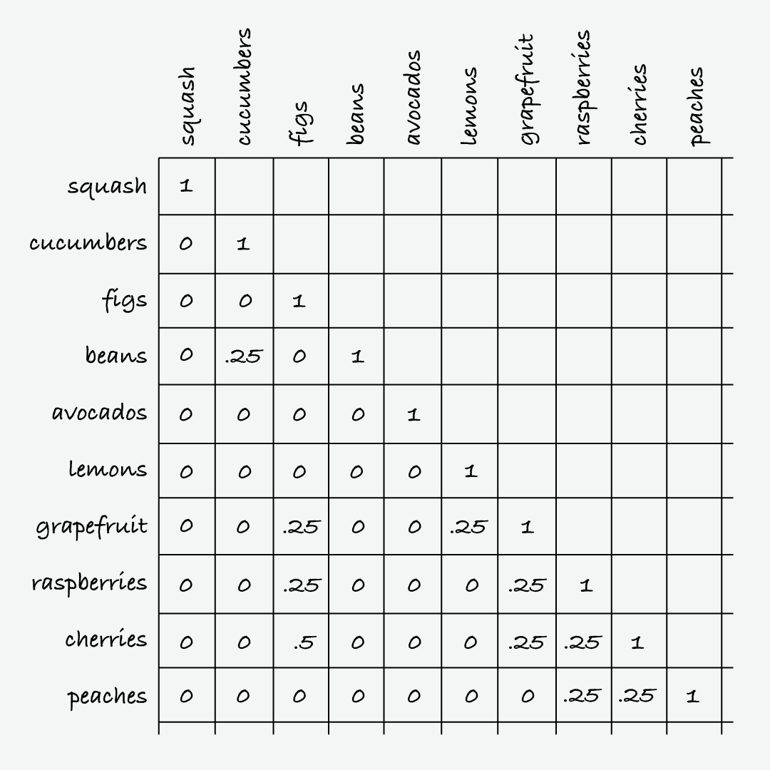
You can do pairwise comparisons for up to about 30 items manually. Label the rows and columns in a spreadsheet with the elements you want to cluster; so for 30 items, you’ll have 30 rows and 30 columns. Then, in each square, decide how similar each pair of items are on a scale of 0.0 to 1.0. (It helps to use a limited number of values, like 0.0, 0.25, 0.5, etc.) In my example involving fruits and vegetables apples and applies are perfectly similar and score a 1.0, while apples and oranges score a 0.5, and apples and lettuce score a 0.0.
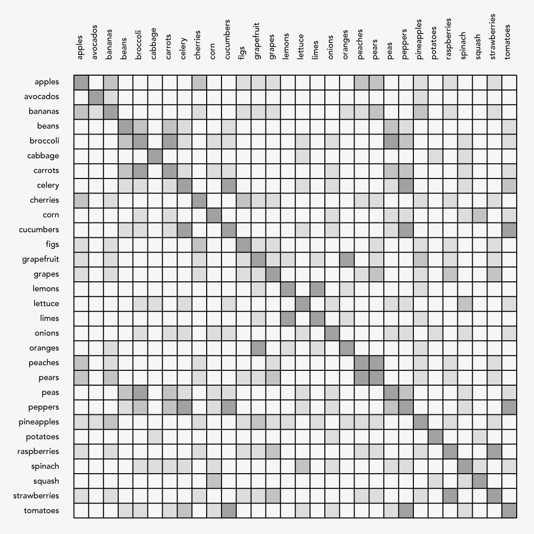
A card sort can help you cluster up to about 100 elements. Run an appropriate number of tests, and make lists containing the items in each group that participants created. Next calculate the Jaccard Index for each pair of items: this is the number of groups where both items appeared together divided by the number of groups where at least one item in the pair appeared. Record each score of 0.0 to 1.0 in the matrix. It helps to use a script to do the math, and more involved scripts can compare even larger sets.
Clustering data by hand
Once you have collected similarity data you will need to produce a chart called a dendrogram: it’s the tree-shaped chart on the left in my fruits and vegetables example in the downloadable poster of this information.
To make the chart, start by placing each item in its own group. If you are clustering a set of 30 items, you will start with 30 groups. Next, compare each item against each other, looking for the items with the highest similarity score. If there are multiple pairs of items with equal similarity just pick any pair for this round.
Repeat this process, looking for the next most similar groups. To calculate the similarity for groups with multiple items you will need to choose a “linkage method”. Compare each possible pair of elements in each set. For single-linkage clustering, the similarity of the groups is equal to the lowest similarity of every possible pairing of items in each group. For complete-linkage clustering, group similarity is the highest similarity score of each possible pairing of items. You might want to experiment with both of these options because they produce different kinds of clusters. Repeat the process, comparing bigger and bigger groups, until all groups have been consolidated into one.
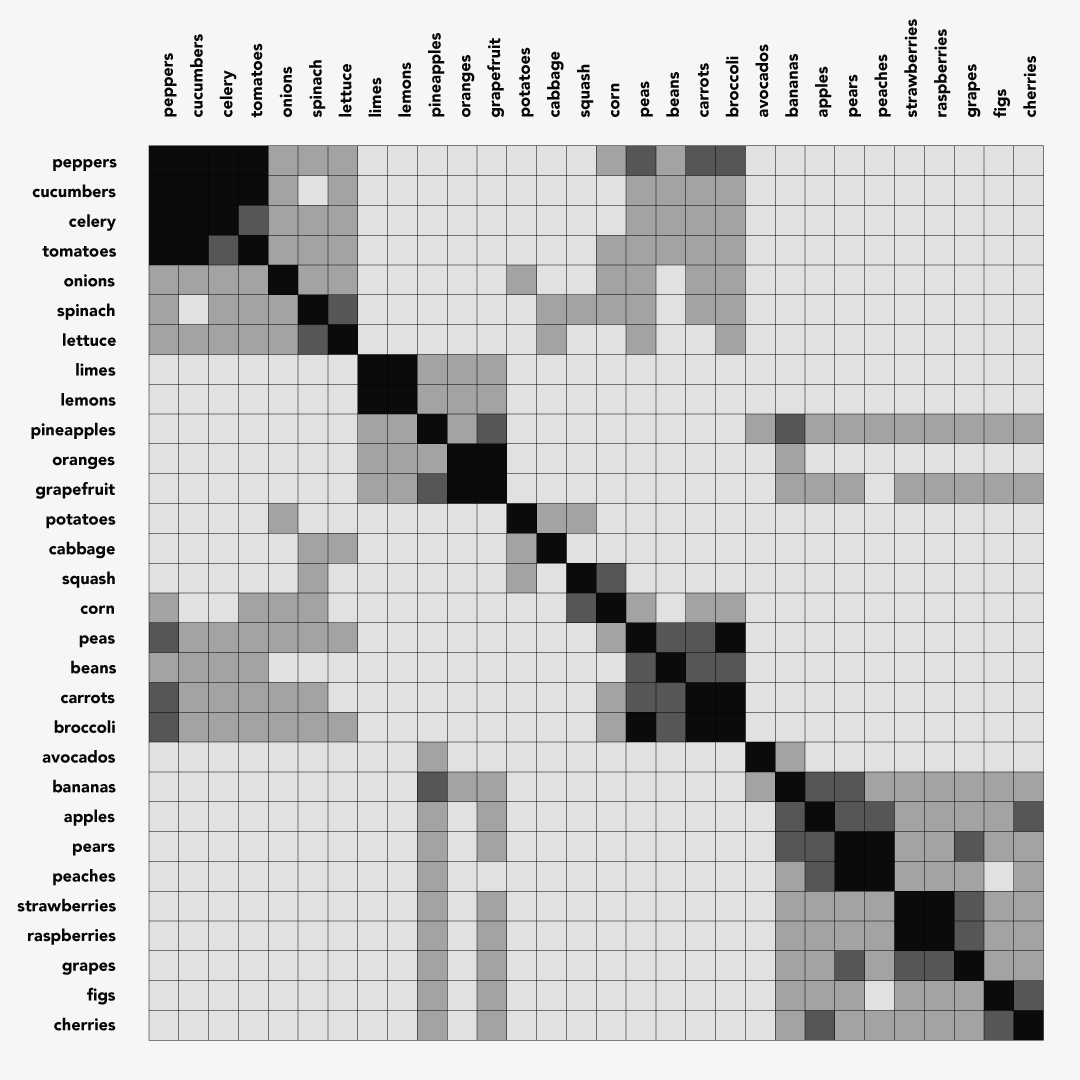
Sorting the matrix
The order of elements in the dendrogram provides a sort order for the similarity matrix. When the matrix is sorted, you should see clusters along the diagonal. The dendrogram shows the Jaccard Index where each cluster and subcluster formed, and the similarity matrix now shows primary clusters along the diagonal and secondary clusters in other places in the chart.
Other visualizations
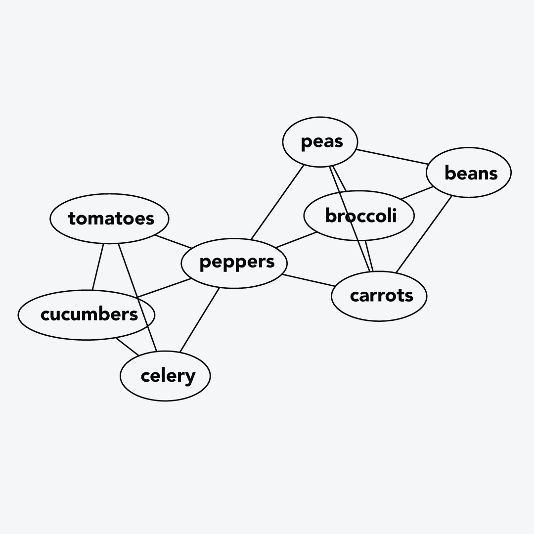
Once you have similarity data, it’s easy to produce other visualizations as well. Here we made a graph where nodes connect whenever a similarity score is at least 0.5. This graph was produced using Graphviz.
Next steps
There are lots of different ways to do clustering—switching out the clustering algorithm itself or the similarity measure can have a big impact on the resulting clusters, and the computer performance and the number of data points you can manage. Try K-Means clustering next for something different.
For me, hierarchical clustering was a perfect place to start, and I hope these notes help get you on your way. Happy clustering.
Team
I teamed up with Emma Boettcher to give a workshop on clustering at Designing For Digital in 2020. Thanks very much for teaming up, Emma.